I will show 8 bad Notion image carousel designs encountered by those who want to make aesthetic Notion templates but cannot. I will also explain their solutions. 🎉
I studied graphic design at university. I graduated. So I’m a designer with a certificate. 🙂 Although we want to make aesthetic Notion templates, we can sometimes use even breathtakingly beautiful tools badly. The first one of these:
1. Use Only the Notion Image Carousel!
You might like to add a Notion carousel image to your template for a more aesthetic design. But the problem is that “only” adding it may not be enough. It is not enough to have your template with only 1 feature. The basic formula for making an aesthetic Notion template is “details“. So don’t think that you will be guaranteed with only one thing. (Example: only 3d carousel slider image)
2. Sizes of Images in the Notion Image Carousel
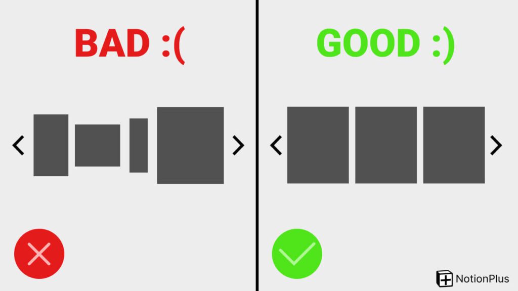
Slide’s just sitting there. Waiting to be used. You can use it when you add an image to it. The problem is that when you add images of different sizes, you get an ugly image. One big and one small. That’s not aesthetic!
The human brain works on colors and symmetry. Not only that, of course. But symmetry is important in this case. If you want to use a beautiful carousel, make each image the same size. For example, make them all square. 500×500. Or rectangular. Maybe a triangle. But let them all have a layout. In this way, you will get better-looking designs.
The human brain operates based on colors and symmetry, among other factors. Symmetry holds significance in this context. If you want to use a beautiful carousel, make each image the same size. For instance, consider making them all square, such as 500×500, or rectangular, or even triangular. The key is to maintain consistent layouts for each image. This approach enhances the overall visual appeal of the designs.
3. Use Outside the General Design
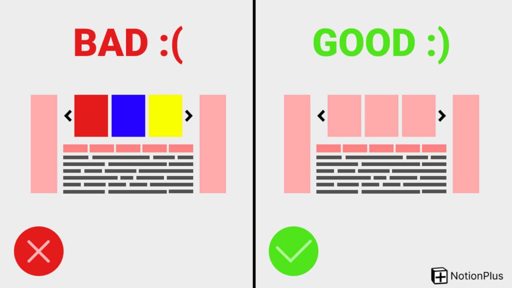
If you have designed a red-intensive template. If the images are colorful, this is not aesthetic. You can add images in shades of red instead.
4. Problem Adding Link to Carousels
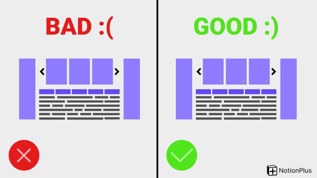
You can add a link to each image. However, the user does not know if there is a link in that carousel. That’s why you need to tell him that there are links. Either you explain it with a text. Either with a video. Or you write that the carousel images can be clicked on either the first or all of them. Or you can be more creative and add a mouse pointer image there. After all, it must be understood that it is clicked. Otherwise, you cannot convey your message.
5. Adding Too Many Images
It depends on the Notion templates you make, but in general, putting too many images can bore the user. This is something we don’t want, so it’s better not to go crazy like adding 100 images.
6. Adding Very Large Images
Adding 4K images or adding very large images creates a disadvantage for you. Because covering the whole page affects the experience badly. Your goal is not only to design aesthetic Notion templates. It is also to ensure that the template does not lose its purpose. If you make designs that will not be used, no one will use it.
7. Bad Font
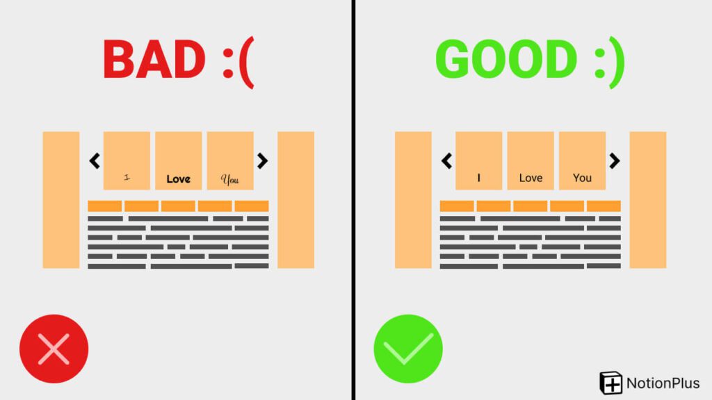
Utilizing a font that fails to complement the design you’ve crafted results in an aesthetic disconnect. The chosen font should seamlessly align with the text presented within the image. The selection of fonts for text in images plays a crucial role in shaping aesthetics.
8. Mismatched Colours
I have already mentioned colors, but colors are also important in the text used in the image carousel. Never use incompatible or very close tones! In other words, if you place white text on a light yellow background, it will not be easily readable. To resolve this issue, you need to select a different color that provides sufficient contrast between the text and the background. Of course, this scenario applies to a scenario where you are willing to write white text on a light yellow.
In fact, you can see that the basic design rules work here too. I strongly recommend confirming the designs. Sometimes we focus so much on designing that what looks great to us can look terrible to others. You can do this by asking someone. Or you can do it by stepping away from your design for a while. For example, give a day off. When your holiday is over, you can be sure that you will design with a completely different spirit.
If you want more articles on “How to Make Aesthetic Notion Templates“, please subscribe to the newsletter for free.